Wednesday, 6 May 2015

App - Initial Sketches


Going into detail about the games and the outcomes we want to come out from it.


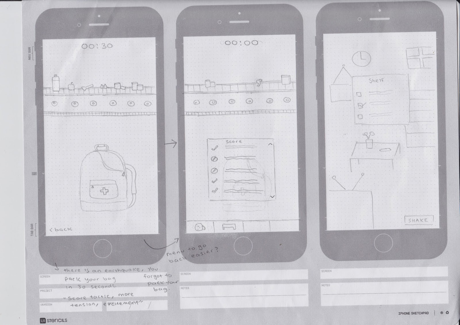
- Emergency kit preparation. This will allow the kid to pick and drag certain objects into their emergency kit. There will be a timer to create some sort of tension and get kids to think on their feet. Once the timer runs out, a information bar will pop up to let the user know what they got correct/wrong with a small blurb about each item they picked and why it was either a good/bad choice. 


- Second game is still the same as our initial idea. The user will be allowed to click an item/furniture in the room and have a selection of actions they can performed. We decided to take away the 100% process bar so the user can have a immediate answer to see if they were wrong or correct. Maybe the items will glow red or green depending if they made the right choices. This will indicate what they are getting right and what they need to know more about. 


- The third game is the "stop drop cover" drill which will allow the user to perform and learn about earthquake safety (what to do during an earthquake). Taking the initial idea of character selection (theme) to attract kids and keep them interested. Still a working process. 


-Rebecca

Sensor & App Finds


Dumb ways to die app
-Using quirky and cute (fun) visual style to appeal to their target audience. 
-Although they are addressing a serious issue (trains) they didn't make it gruesome.
-The game allows the user to see the consequence of the issue but they kept it toned down for 
the demographics. Since we are targeting a similar age range, we could consider these aspects.
-Tilting using the gyroscope sensor. It may be useful for our app in terms of movement. 
-Touch button (flick)? Maybe we can consider sliding motions for the "drop, cover, hold" position.


-Could also consider using a camera to detect your moves for "drop, cover hold" This will allow the user to experience the movements themselves. They could either place the phone somewhere higher or get their parents to hold it? There could be a shadow that can help guide the user / do the same movement within the shadow.


- Looked into some more visual style. I really like the choice of colour palette and bold images in this particular app. The font also fits quite nicely with the overall theme. It's also aimed at a similar age range to ours. 


-Rebecca

Saturday, 2 May 2015

Sitemap Exercise & Initial Sketches


Had a discussion about sitemaps, and how they may affect us and act as a guiding tool throughout our app design. This was an exercise we did to get familiar with sitemaps. Attempted my first sitemap, choosing Line messenger as my app. 


Ideation mapping: Drew up some rough sketches of what the app may look like. Still considering our sensors at this point. I tried to incorporate accelerometer (motion sensors), where the user shakes the phone and it vibrates to create a imitation of an earthquake. We could also consider some sound as this point (rumbling sounds). 

Top left iteration: Shaking the phone (accelerometer sensors) to see what happens when the magnitude increases in an earthquake. An information bar will slide out at this point to give details of the impact. The user can swipe the information bar back and can repeat the process. This will also be shown through animation where buildings start moving and falling as the magnitude grows higher. (Magnitude increases every time).

Bottom left iteration: A mini game where the user has to click on the objects inside the screen and pick an action (box will appear when the user clicks an object) which will lead to different scenarios e.g. secure photo frame. There will be a process bar. Once it reaches 100% the user can shake the phone which will cause a vibration to create a imitation of an earthquake. If the user had picked the right choice, then the items will remain where they are. Otherwise they will fall and break. 
Still refining this.

First left iteration: Informative page with a small animation to keep the kid interested. Explanation of earthquakes and tectonic plates. The animation diagram shows what happens when there is a earthquake. 

Second left iteration: Home screen. Still deciding what we should put on the home screen. But this is an idea for now.


1. 
-Swipe to pick your character to learn about earthquake safety.

2.  
-Shake phone to make earthquake (starts and keeps going)
-Hold person and phone still so they don't move. 
-Phone vibrates to show earthquake still happening.
-Once the vibration has stopped, you can let go and follow steps to lead character out.
-Room has the same theme as the character (more realistic)

3.
-Similar to a pacman game
-Walk person out of the maze. There will be hazards and they will vibrate and educate why it's dangerous


-Rebecca


Group Exercise MOSCOW Analysis / Matrix

Matrix

We were asked to create a matrix table to identify, analyse and unpack our chosen emergency (earthquake) more into depth. We used the matrix to identify whether to design the app for before/during/after. The stakeholders that would be interested in our app would be the NZ Police, Red cross, Civil Defence. We originally decided to target children ages 6-9 (both genders) but gradually changed it to 7-10 as the language and visual style that we wanted to use seem more appropriate for that age group. As adults tend to be more familiar with the safety procedures of an earthquakes, we feel that kids need to learn/be reminded about the danger of earthquakes and how to be prepared and ready if one was to occur. Children are also able to easily access apps these days. 

The exercise helped us narrow down and decide on a approach for the app.


Moscow Analysis

Must:
-Intro to earthquakes
-Easy to navigate/use and straight to the point. 
-Positive visual style
-Fun but informative (educational)
-“Drop, cover, hold” (Instructions)
-Emergency escape plans & safety procedures
-Build an emergency kit
-Educate kids about what to do if there was an earthquake.
-Appropriate language (age range 8-12)

Should:
-Interactive
-Colourful palette (Fun Colours)
-Visually Appealing
-Earthquake drill

Could:
-Show affects of an earthquake
-Music input
-Quiz

Won’t:
-Wifi (Keeping scores)
-Login Page
-Use scare tactics
-Complicated language 


We were asked to write down the main points from our previous MOSCOW analysis on a A5 piece of paper. This was to get an idea on what sort of approach we were going for. 


-Rebecca, David

Friday, 1 May 2015

Initial Research & Style


Illustration Style
For our illustration style, we wanted to keep to a clean and simple design that can easily bring our idea across to our users (children ranging 8-12) while also being visually appealing on a mobile screen. We decided to use vector images as they are more suitable for kids in terms of design. After researching a few existing apps, it seems that most apps that are aimed for kids, had kept their illustration style very minimal (flat designs). 

Icon Design
Our target audience are children ranging from 8-12. Due to this, we feel that we should keep our overall design simple by using restricted colour palettes. We want to create a design that clearly communicates our idea. Colours are also a major factor that we have to consider as this could possibly attract our target audience while keeping them engaged. Could consider bright colours to make the app look visually appealing and "fun" but still keeping its intended purpose with the information provided. 


-Rebecca


100 thumbnail exercise & Initial sketches


Plum


-Rebecca

Fly


-David