Thursday, 28 May 2015
Rationale
We began this assignment with earthquake as
our emergency, focusing on what to do before an earthquake. We are targeting
kids ranging from 8-11 years old and this app aims to teach kids about safety
and hazards from different areas within a house. This app is designed to
educate kids on what furniture or objects they should avoid during an
earthquake and what ones they need to remember to help them stay safe. This is
demonstrated through a game where the kid is able to select different rooms in
the house to have alternative scenarios with the furniture that are available
in the specific room. The house also includes a backyard to educate kids what
to do if they were outside during an earthquake. We specifically focused on
touch sensors as they are simple for kids to use and it also helps mimic the
direction of the earthquake drills. In terms of visual styles, we wanted to use
simple vector to help with navigation. The colour pallete are also kept bright,
as it is more appealing and approachable for our target audience, while also differentiating
the rooms in the house.
-Rebecca
Wednesday, 27 May 2015


Tuesday, 26 May 2015


Hazards
Windows : stay away from windows as, it will crack and break, causing injuries and cuts.
Bed: not safe, won't cushion solid objects falling from the roof
Book shelf: books falling on top of head
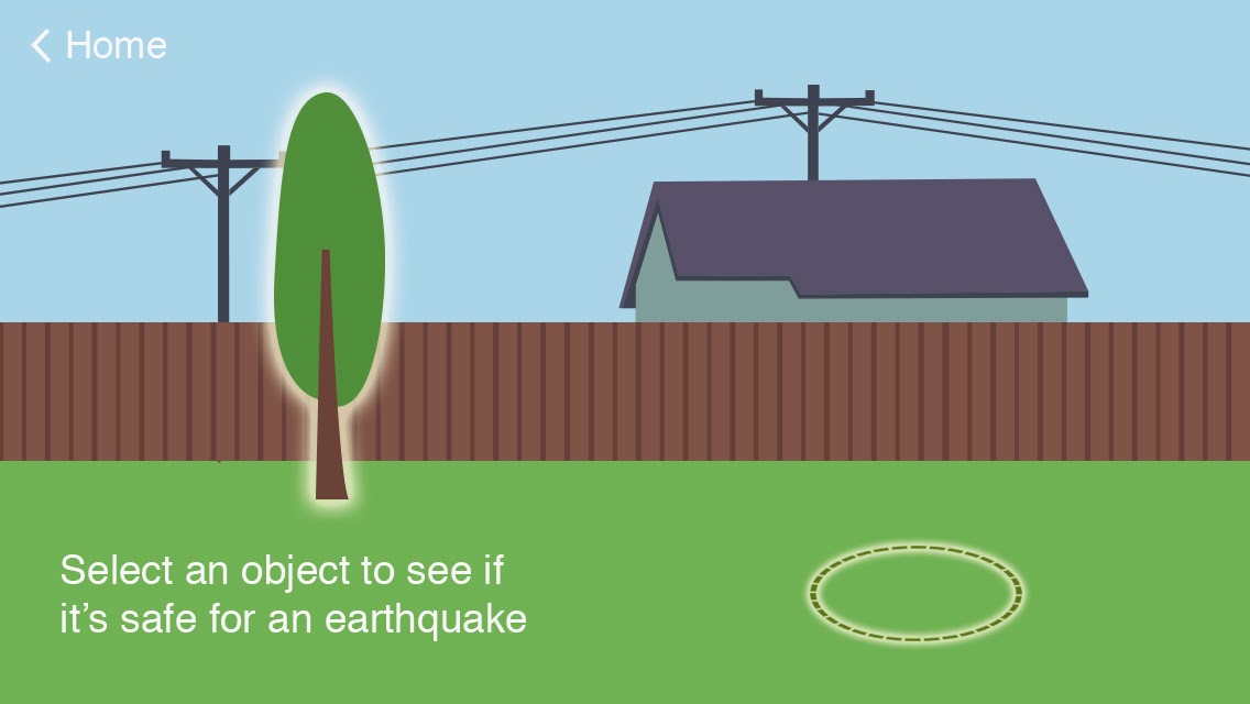
Outside: stay away from anything that could break and fall. stay away from power lines.
-David
Bed: not safe, won't cushion solid objects falling from the roof
Book shelf: books falling on top of head
Outside: stay away from anything that could break and fall. stay away from power lines.
-David
Thursday, 21 May 2015
Revised Prototypes (Second user-testing)
Home Screen (Alternatives)


Bedroom


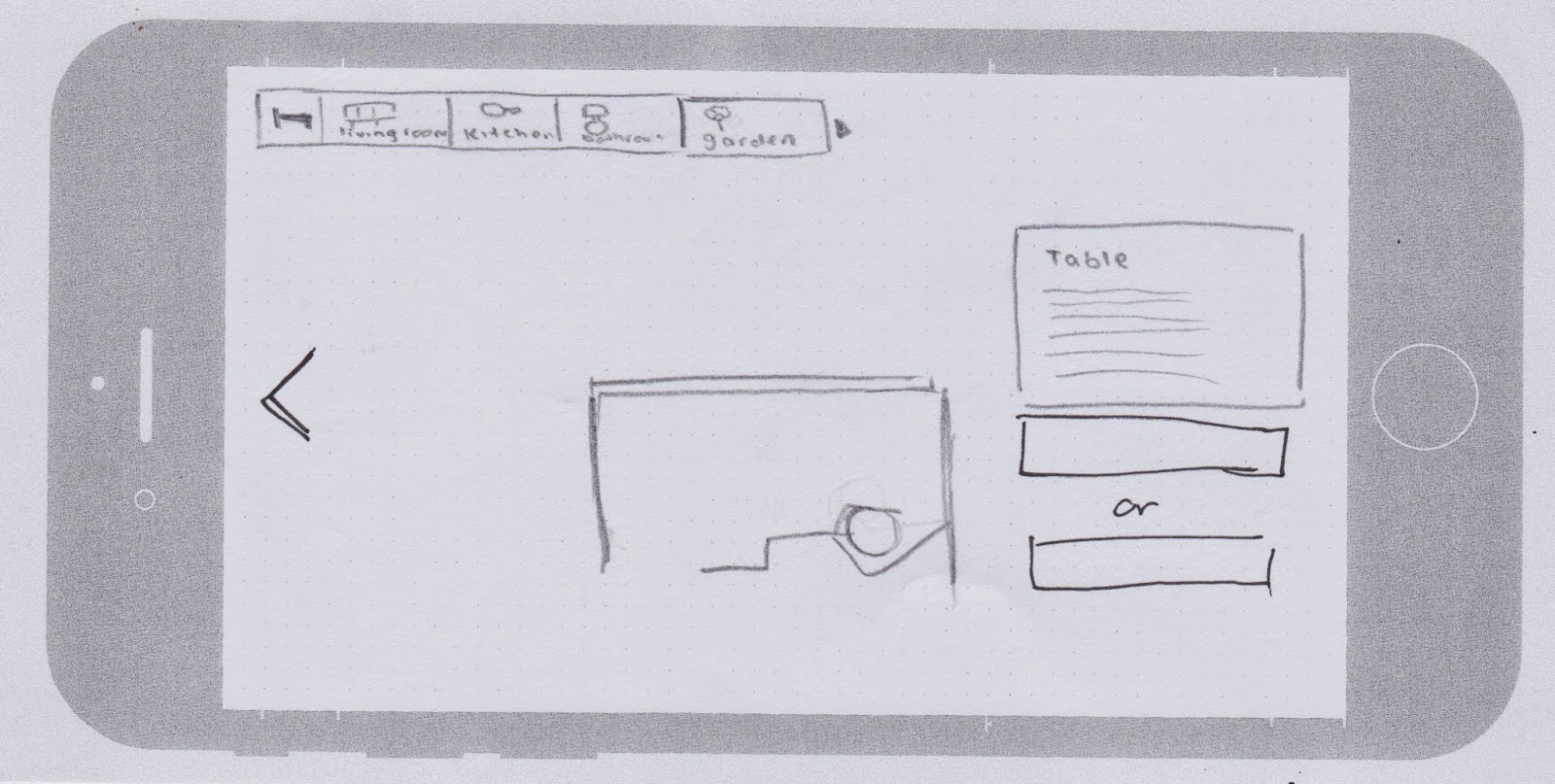
Living Room


Garden (Outdoor)


Had some peers do a second user-test on our app. They quite like the idea of the house homepage as it is more cohesive with the other screens. Some problems that popped up was the uncertainty of what furnitures are clickable. Had a discussion that we may add some type of glow to the clickable furnitures and once they are completed, it will turn either red for hazards or green for safety.
Also had a discussion about a "back" button that will allow the user to go back to the homepage. We were suggested that there should be an option to go back to the room you were previously in so they can try out the other furnitures in the room. From there, there could be another back button for the user to go back to the homepage to select another room if they wish. The slide button wasn't working out so we will be removing that as a whole.
Other details that was suggested to us: we could show a mini version of the furnitures in each room on the homepage. Give a sense of what is in the room?

-Rebecca, David
Wednesday, 20 May 2015
Additional Research : Earthquake Safety
Looked more into earthquake safety tips. This images and video helped us get a clarification on what sort of approach we were aiming towards. Most likely a user experience and educational app.


- DavidThursday, 14 May 2015
Revised Sitemap, Wireframe, Moscow & User testing


-Rebecca

User testing feedback:
-Think about the placement of the magnitude & tectonic plate slides. Or remove them completely as they don't really relate to the idea of safety and hazards. Having them at the start might confuse the user as they might think it's a slideshow rather than a game.
-Instead of the drop down menu, maybe try one where it slides out.
-Selection of rooms? Instead of going straight to one room at the start, let the user select the room they want.
-Make other furnitures clickable?

Revised moscow.
-Rebecca, David
Subscribe to:
Comments (Atom)